Elements of Design & Principles of Design

In this photograph one of most prominent features is the color. This photo has a gloomy feeling to it. This being because of all the cold colors involved, such as the dark blue of the water. It doesn’t help that the elephant and the man on top of it also are showcasing cold colors. The other element of design in form. Form describes the appearances of objects and this is exactly what is happening in this picture. You can clearly see that the grey thing in the water is an elephant. As for principle of design I find that emphases plays a big part. Because, there is a lack of other things and objects in this photo your eyes go straight to the elephant and man on top. To which I would say is creating a more powerful image. Lastly, this photo holds a lot of balance. Even though the photograph has a similar colors in it I personally find it quite balanced. Nothing is too much and there is nothing that is too little to look at.

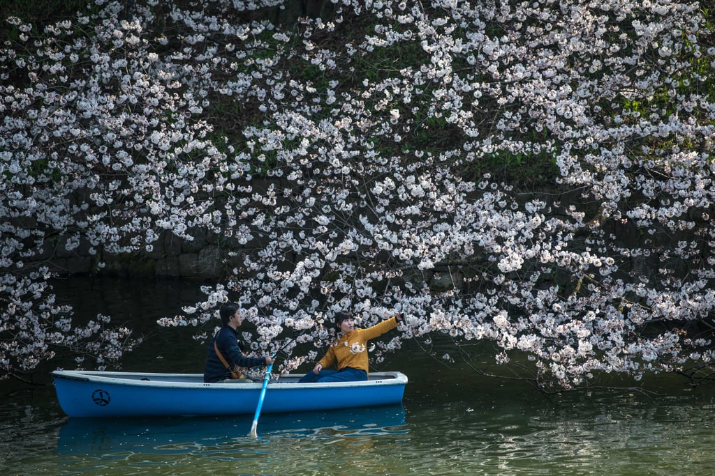
This photo was definitely captioned at the right moment everything seems perfectly in place. That is why I would say size and shape were two important elements in this photo. Like I said everything seems perfectly in place and that is because of size (kind of). The whole picture seems very proportionate. And for shape there is almost nothing that seems abnormal or an eyesore to look at. Because, everything seems so put together proportion seems like one of its important qualities. However, so does repetition. There is many flowers and without them the picture would look rather dull and maybe even boring.

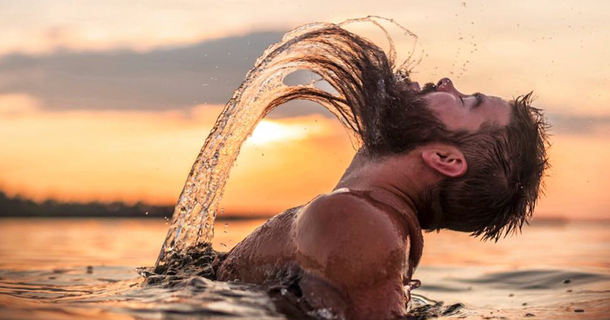
Majestic doesn’t even began to describe the grace and beauty this photo carries. Tone is quite a large part of this photograph not only does it provide warm colors but also a warm feeling. Another big part of this photograph is texture. This man’s hair adds so much realism to this picture and makes it enjoyable. Also the water adds just another level of realism. As for principle of design characteristics the photo involves a very balanced environment. All the tones used make a clear understanding that the sun is possibly raising or setting. Lastly, is the construct of proportion in this photo. It is obvious that this man is the canvas and the background is just supporting that idea.

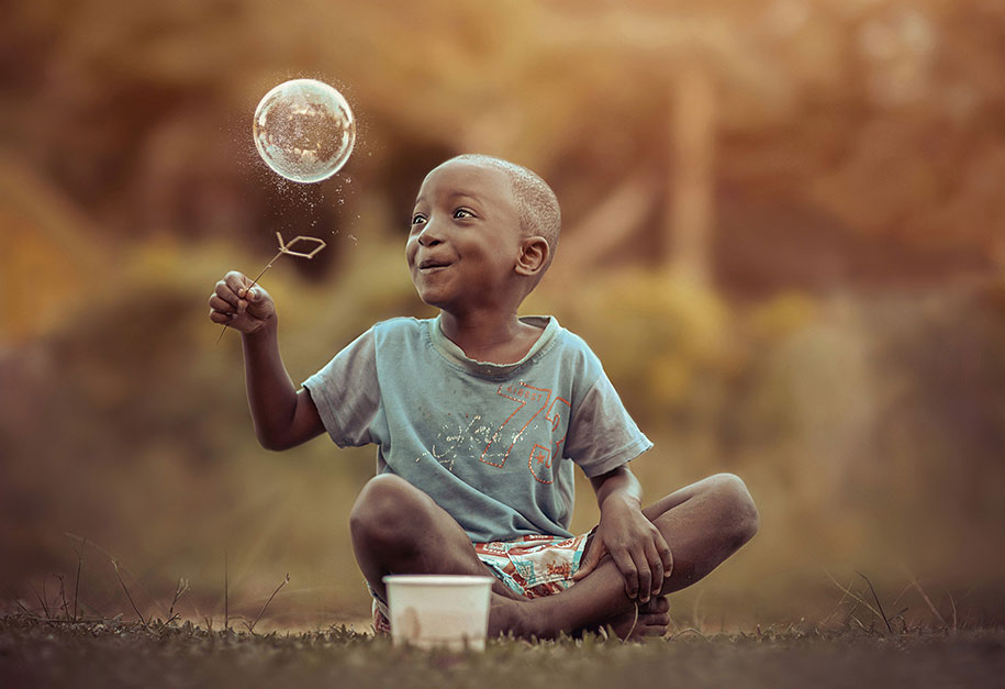
Nothing but pure joy in this picture. It is flooded by the idea of kids and their innocent. As small as the idea of texture is in this photo it really sticks out for me. You can clearly see most of minuscule details, such as the grass. Form has to be an essential part to this, because of the bubble. Form is describing an objects appearance. So it describing the bubble and to me the bubble is a key part of this photo. That’s why I would choose emphasis as one of my main principle of design characteristics. Because, the bubble has a lot of contrast since being that it has an entirely different color scheme from the rest of the image. So your eyes go straight to it.

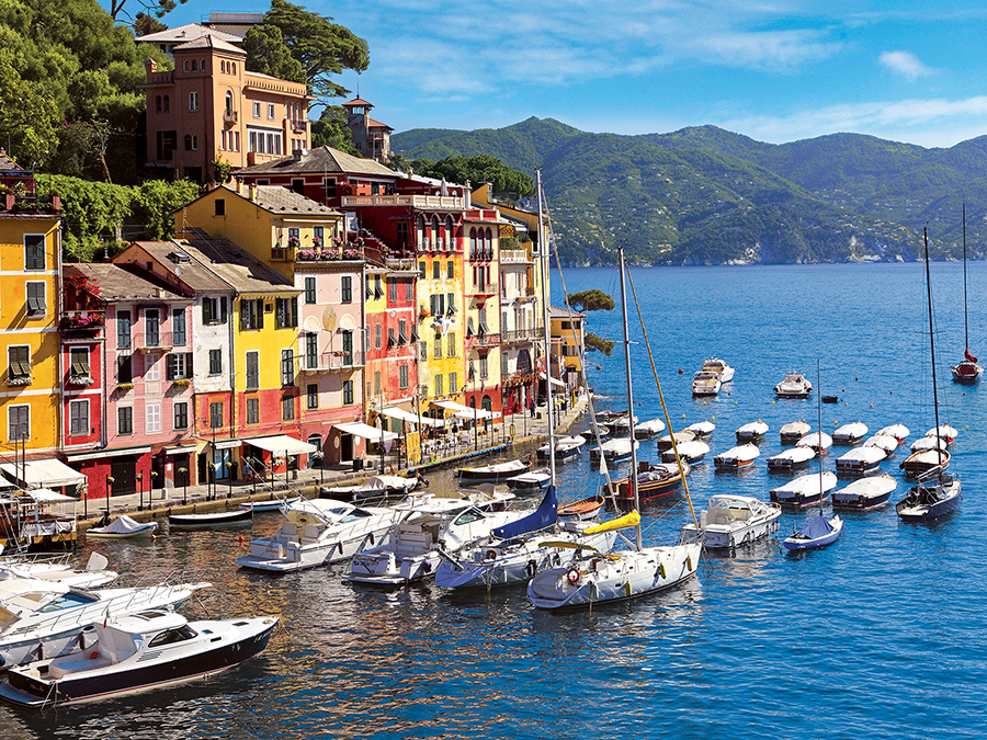
This photo is quite bright and cheery and that’s why color is one of its strongest elements of design. Everything in this photograph just jumps out at you. Nothing is dull and uninteresting to look at. Other than color, line is also another one of its key elements of design. You can see the culture within the shape of the buildings. Also, in this picture everything seems nicely in place. So that’s why proximity and proportion are two major principles of design in this image. It mostly looks like all the boats are in the right spot and not overlapping each other. Besides, the boats and their spacing this photograph has the actual sizing for all the objects in it.