Element of Design & Principle of Design
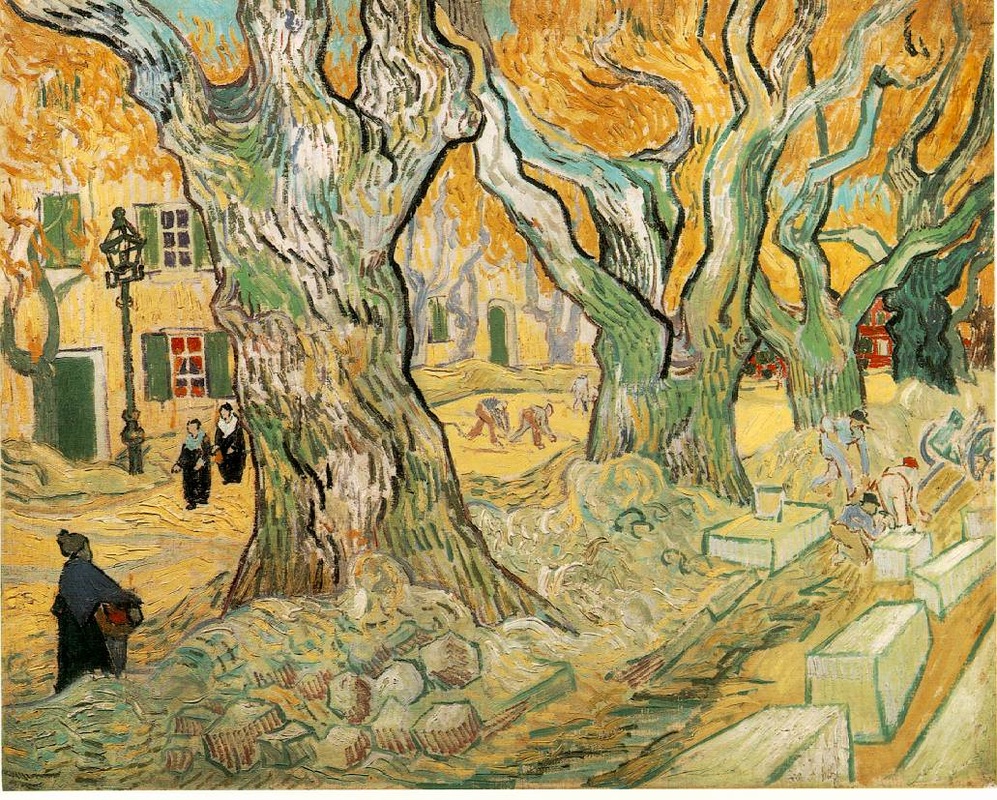
- Line: Lines can go from thick to thin and jagged to dashed. Their main purposes are to give length to another object and show direction. Lines are also used as an good describer of the way an object looks.


- Shape: Shapes can be made by lines or edges. They are flat objects that can be areas of color, tone, or texture. They can be described as simple, complex, and angular. Some shapes can be be described as both simple and angular. Or they can be called negative or positive shapes.


- Color: Color is produced by light. There are three primary colors that make up the rest of the colors. These are red, yellow, and blue. To make different shades there is the addition of black and white. Color can add the mood and theme to an image making either cheerful or depressing.

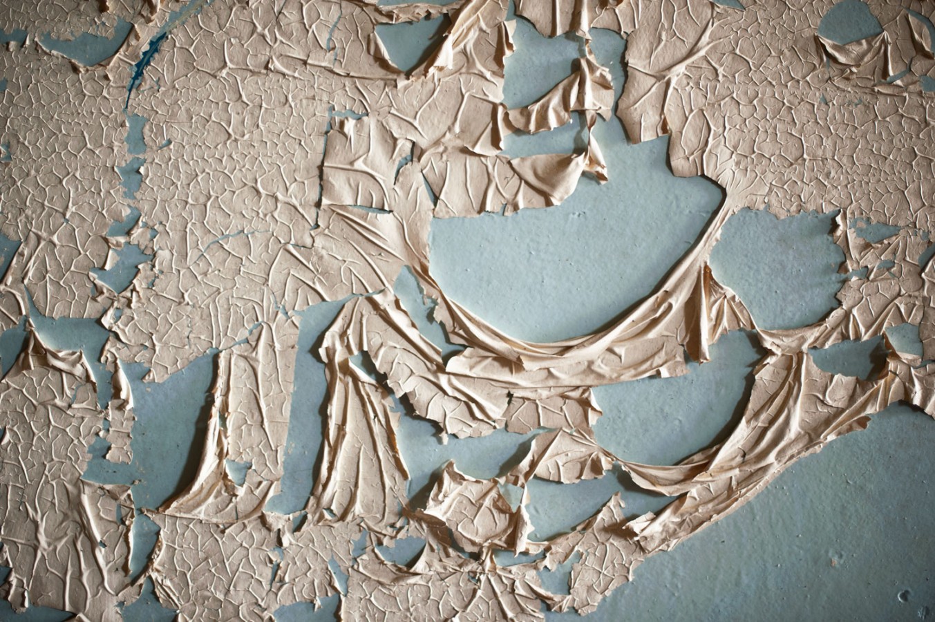
- Texture: Without having to actually touch the photograph you would know how it feels. Texture is made up by things like line, color, shape, and tone. It adds realism to picture. It also provides a metaphoric idea to some images.
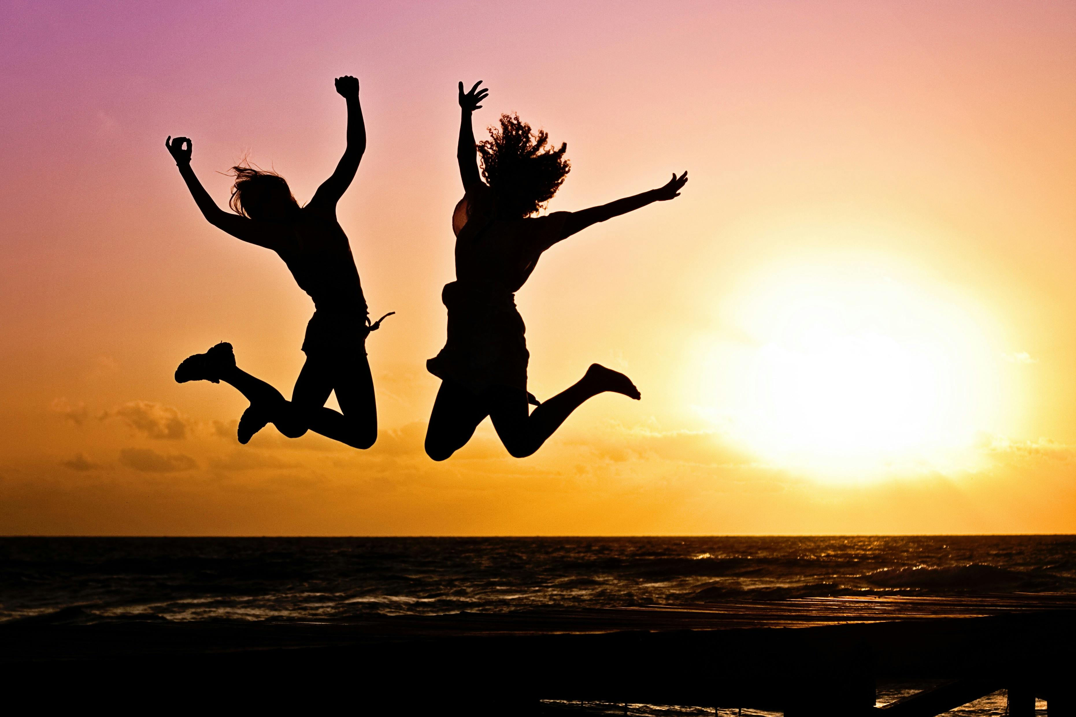
- Emphasis: It is when there is one center interest of the photo. Used in pictures that want your main focus to be on one important thing that is within the photo. With images with an emphasis the other objects in that picture may be dulled or toned down.
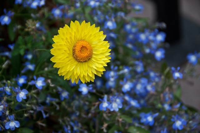

- Contrast: When an object is clearly different then all the other objects within the area. Sometimes the objects may be very close to one another but just a different color. Used in photos that want to have an emphasis. Or possibly just to show how contesting the object is to another.


Proportion: When all the parts relate together in size. Nothing is too big or too small. In a photo it can be way to balance it. Or it can provided realism. Such as a drawing an human being. To have it look real you need all the parts to fit well together.


- Repetition: Is when there is plenty of the same or alike things all together. Used in photos they may want to have an emphasis on those repeated items. Or give the photograph more flow and unity.


- Typography: It is written words on a photo. The font of the writing could make or break it. The font should reinforce what the wring is already saying. It needs to add to it and not take away. Used in pictures to add a point or just used to be visually pleasing.


