Explain what typography is and a basic understanding of the history of typography
Typography is the art from of written matter. It is not just different fonts, however fonts are definitely part of typography. It has said to have started as early as 1850 to 1600 BC in Greece. They would use an object called a Phaistos Disk to strap it into paper. In the thirteenth century it become popular. Using one lettered ties to put on a wall to create a word. As time went on this process reminded popular in Europe until the fifteenth century. This is when metal movable pieces were made. This invention allowed a technique to be able to make multiple copies at once. Which lead to the first movable book, The Gutenberg Bible. As time went on digital methods allowed for whole new tools for typography.

Phaistos Disk
Describe the role of typography in media today. How it is used, why it is used, what is it effective for?
In today’s media typography is mostly used for brand adverting. Such brands use different typefaces based on the company’s image. Depending on company, the typography used can add emphasis on whatever message they’re trying convey. It’s all about consumers. Typography gets used, because you want to present your information in a way they’re will understand and admire. It can become very effective when targeted at the right demographic.
A) Find 10 examples of typography in media today (e.g. – film, web site design, advertising, print) and evaluate their effectiveness.
1.

This ad for Starbucks is pretty clean and not an eyesore to look at. Very wisely this company choose to put their words in the design of their coffee cups. I would say it is effective. They added emphasis to the right words that stand out nicely. The message is clearly noted.
2.
Not entirely sure if this brand is real or not. However, it is simple but classy. It is not overrun by random objects or unneeded words. So I would say it is effective. Not only is it well done but, it almost seem intelligent.
3.

This is a pretty basic ad. However, it is simple enough. This being a satellite TV company it prevailed it’s message quite well. Turning the “i” into part of the satellite is creative and fictive. It gives you the chance to connect the logo of the company to the purpose of the company.
4.

I personally don’t overly enjoy looking at this one. The font that they chose makes it hard to make out the words, almost illegible. I find it absurdly block-y. And most of all I don’t really think it’s effective. Assuming it’s an advertisement for a typography program. It is not very clean.
5.

I would say this is an very respectful representation of typography. When most people think of love the image of hearts come to mind. Integrating hearts into the word makes is very effective. So this typography art is well done.
6.

Again, I would say this is a decent example of typography. It is straightforward, but not overpowering. They made a smart choice my representing their words by using the images or objects that have been reckon as their symbol. So it is pretty effective.
7.

Businesses usually always aim to correlate their brand to something we deem as “good”. And this is what Pepsi is doing here with their logo and the word joy. So now for some people when they about Pepsi they think about joy. However, this ad is kind of unattractive with the yellow.
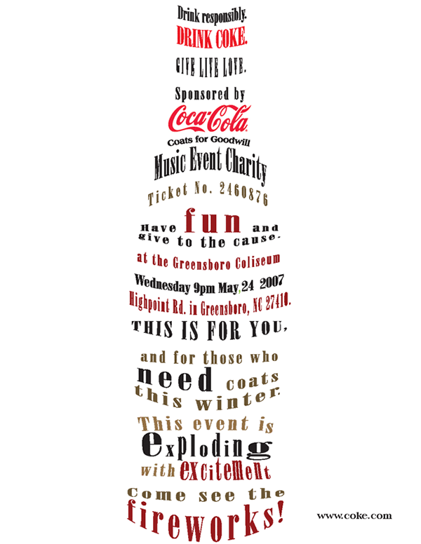
8.

I personally find this image unappealing. The fonts they choose I find don’t fit nicely together. However, they did make the words form in a bottle shape. Which is a part of typography (Images made out of words) OS I would say that this advertisement` is half effective.
9.

This one is a prime illustration of typography. When you think of grilling you think of your grilling tools, such as a spatula. Whoever made this made a smart choice by providing the word with a symbol that kinda represents it. So I would say it’s effective.
10.

This typography ad for Evian water is very eye catching. With all the details it doesn’t give off the feeling of busyness. I would say it effective. The brand of their water is supposed to be “natural spring water” and in which they presented it effectively.